Jukely Sound Projects
Role
Lead designer
Collaborators
Chris Muccioli (Creative Director), Event Coordinator
Stakeholders
CEO, external artist managers, external tour managers, external event producers, external music venue site manager
Project date
2016
Jukely was a subscription service that allowed customers to go to unlimited concerts for $25 a month. It was built around the fact that venues have shows every night of the week and most nights weren’t completely sold out; usually there would be a few extra tickets for each show that they didn’t sell. Jukely served as a middleman, allowing people who wanted to see live music often the chance to take those unsold tickets and discover their next favorite artist.
We learned that if people’s first show was someone they already knew, they had a higher chance of becoming a loyal customer. So the strategy became to start hosting exclusive, members-only concerts to drive home the fact that Jukely doesn’t just help you discover great new artists, we also get you exclusive tickets to artists you already know and love.
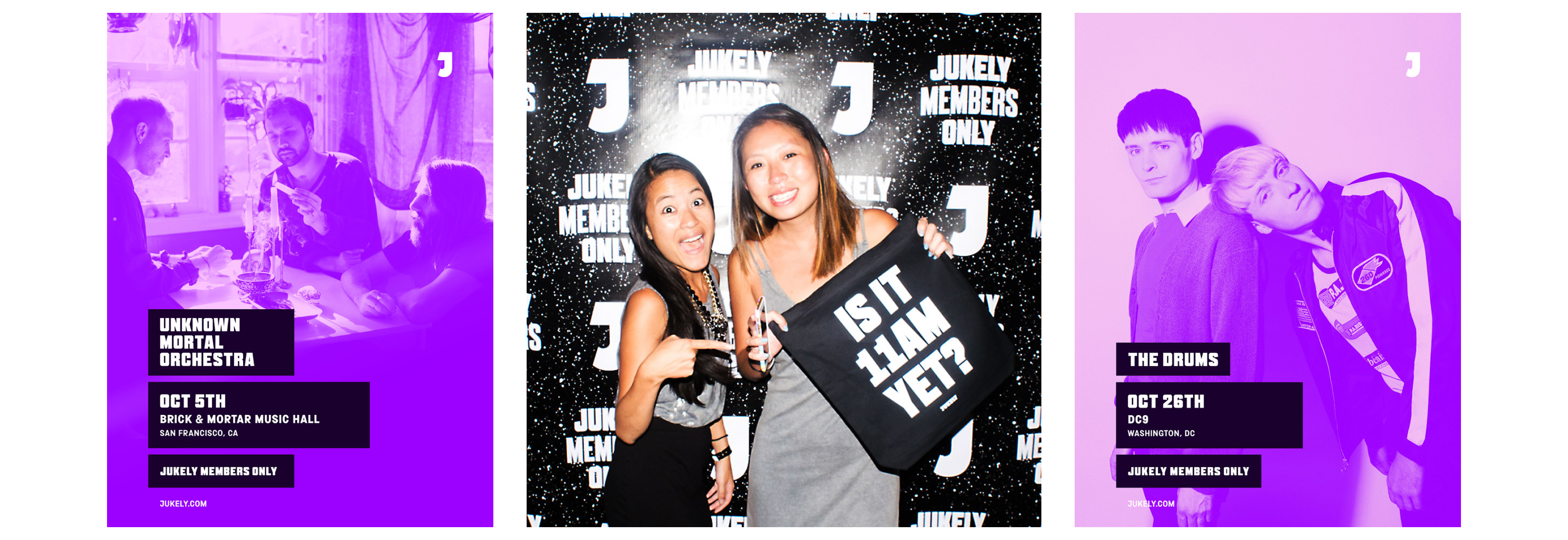
We experimented with smaller, more intimate shows geared toward our indie rock fans, called Members Only, which gave fans the opportunity to see big names in smaller venues. The shows were extremely successful and got us a lot of press with indie publications and helped build our following with indie rock fans.
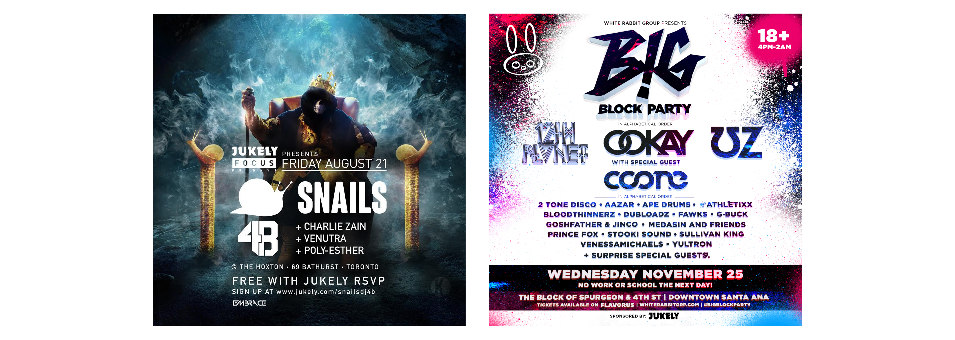
The problem was that the money, at the time, wasn’t in rock music. It was in EDM. When we started reaching out to electronic artists about hosting shows, we got pushback about how overpowering our presence was over their artists’ brands. We were told that if we wanted to do a show with them, our only option was to put our logo on their poster, not the other way around.
We tried doing that for a few shows, and felt that our presence was completely lost and that people weren’t going to associate our brand with those artists or those shows. We were funding the shows and receiving very little brand recognition from it.
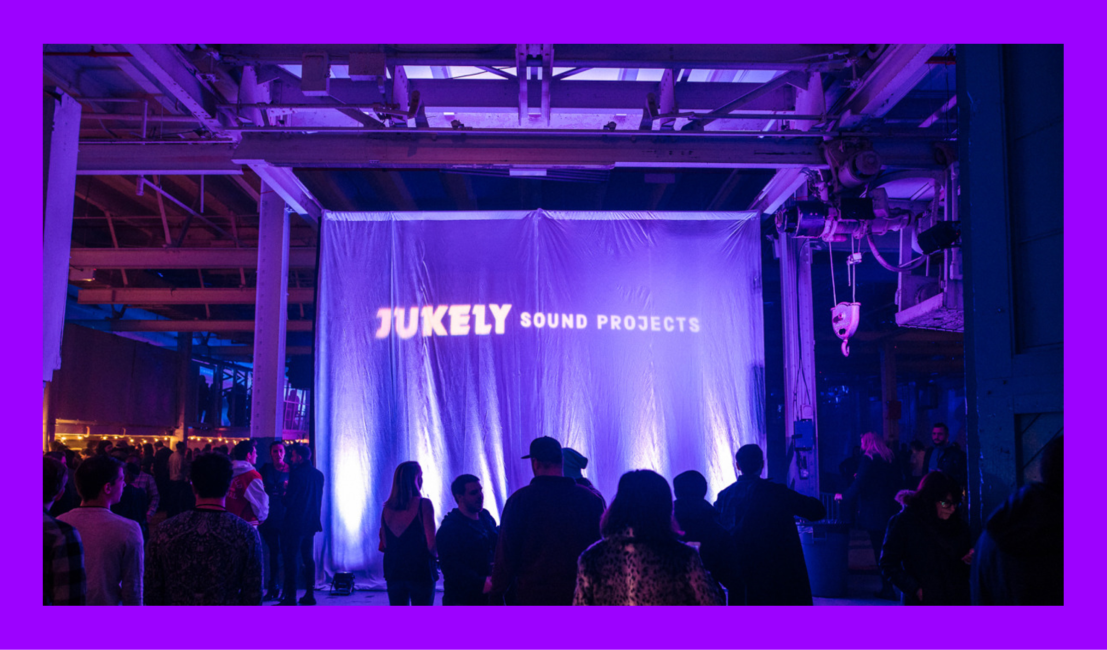
In early 2016, we started trying to figure out how to put our money into bigger shows that encompassed indie artists and EDM that still felt owned by Jukely. The events team and the CEO came up with the idea of renting out a warehouse and doing indie rock shows from 6-11pm, and then doing EDM shows from midnight until close, allowing us to address two big parts of our customer base.
From a branding perspective, the problem was that we needed a system that worked for indie rock, which is used to posters looking different in every city, and EDM, which expects much tighter control over posters. We were spending too much money on these shows for our branding to be too recessive.
When working on the project, we knew that the shows were going to be a series. We needed to find a way to brand the series and couldn’t call it Members Only because we’d also be selling tickets at the door to non-members. We went through a naming brainstorm and landed on the idea of Jukely Sound Projects, giving us a clean way to encompass all of the types of genres and artists we’d be featuring on this series.
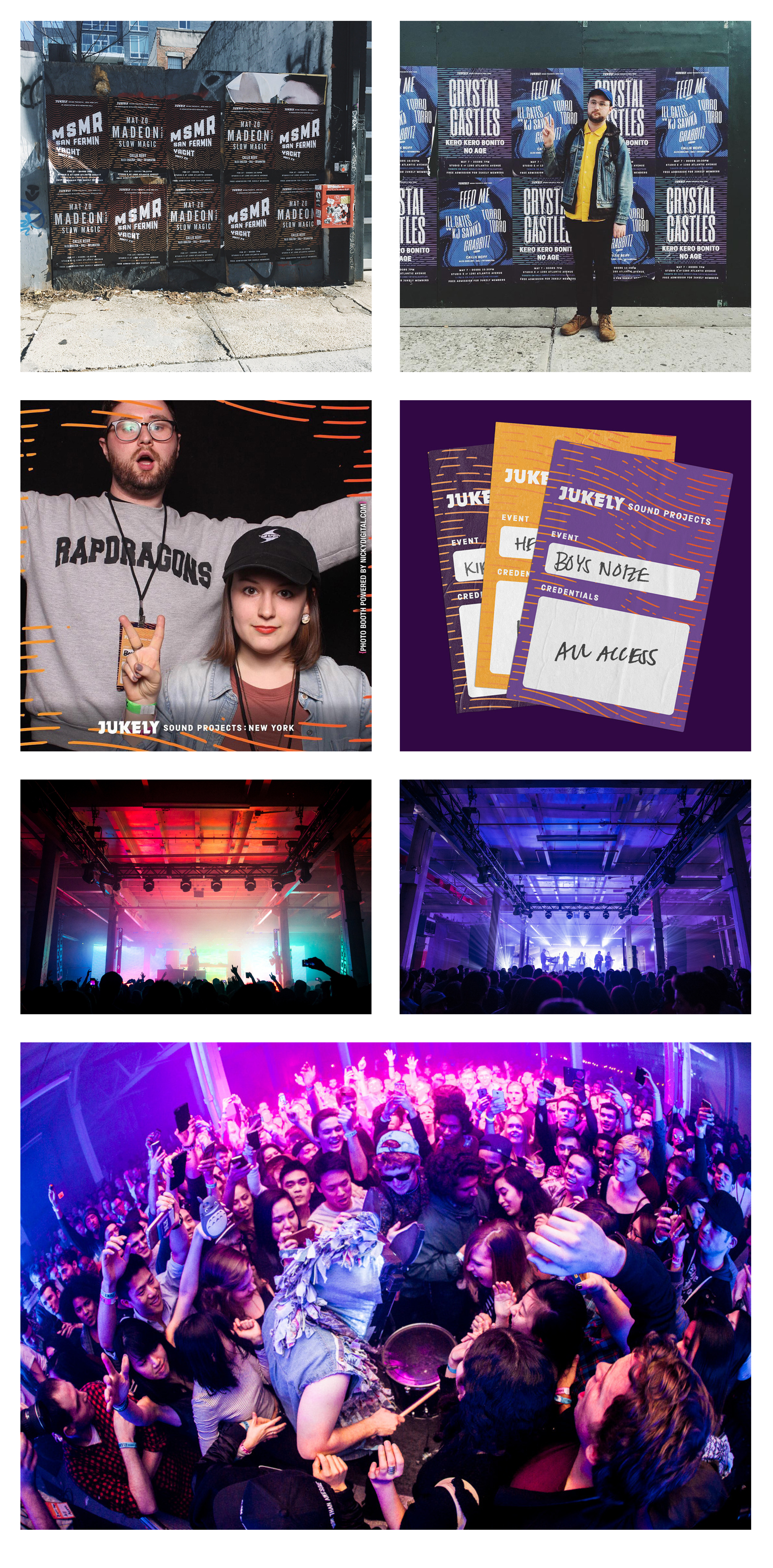
As we started getting into the poster design, we ran into problems with the EDM artists’ managers. Each manager was fighting to make sure that their client’s placement was the most prominent on the poster, even down to fighting over whether the name was on the left or the right when appearing next to another artist. Due to the fast nature of the music industry, we also had very little time to make very customized posters for each event.
The creative director and I were in a tough position trying to find a way to own the shows and also make the artists happy. Did we have enough time to make quality work? Would the artists approve anything branded that we made? Would we be able to unify all of the genres into one visual style? The leadership team was really worried about whether this was possible and worth all of the money we were investing into it, and suggested we give up on branding these shows.
In some recent projects, I had been developing some new styles for the brand that happened to allow me to make very distinct visuals extremely quickly. The work was colorful, unique, and a little weird, and evoked the feeling of a show poster. Meanwhile, my creative director was excellent at making very clean, modern design. I pitched to the creative director that if he created a minimal, clean sandbox to play in, I could quickly make graphics in thirty minutes that would be both distinctive and on brand. After that, we got to work and developed a system.
All of the posters were unified by three things. They all had the same logo at the top and footer, which plainly stated the information for the show. They all used the color purple, our brand’s primary color. And finally, the artist typography wouldn’t be linear or straight, which would give the managers less room to fight about the hierarchy. Once we landed the system, it then allowed me to make posters extremely quickly and easily respond to changes if the artist demanded their name was bigger or needed different placement.
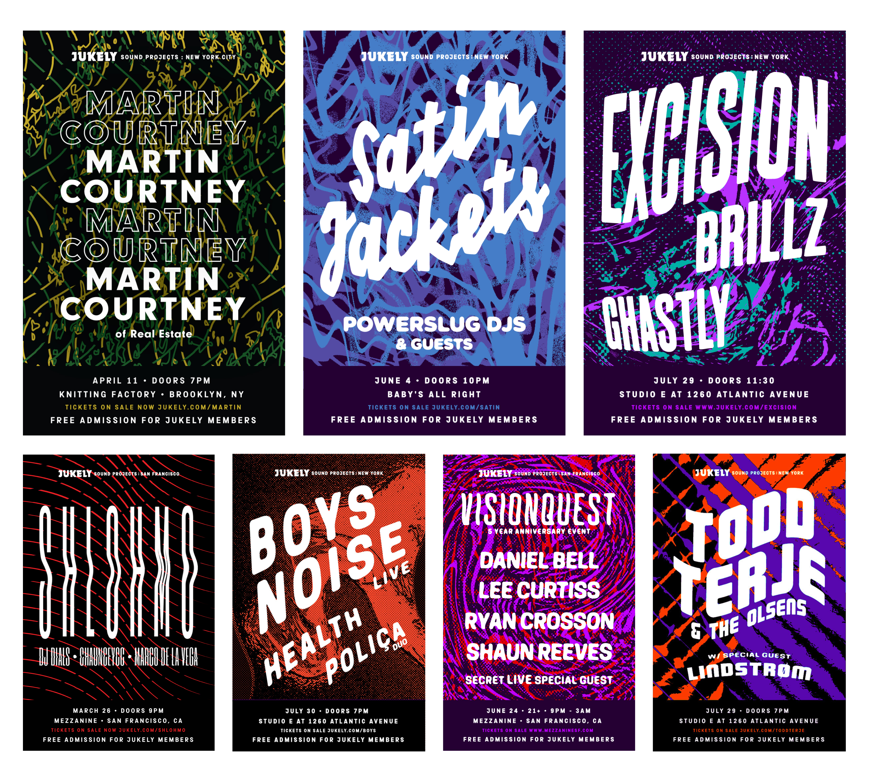
The system was extremely successful and was easily carried over to the event branding and collateral. It allowed the shows to feel special but also solely owned by Jukely. We created backstage passes, photobooth filters, Snapchat filters, and other marketing collateral. Our system was distinct, but also allowed us to mix the Sound Projects branded collateral with the traditional Jukely branded collateral, and it all felt unified.
