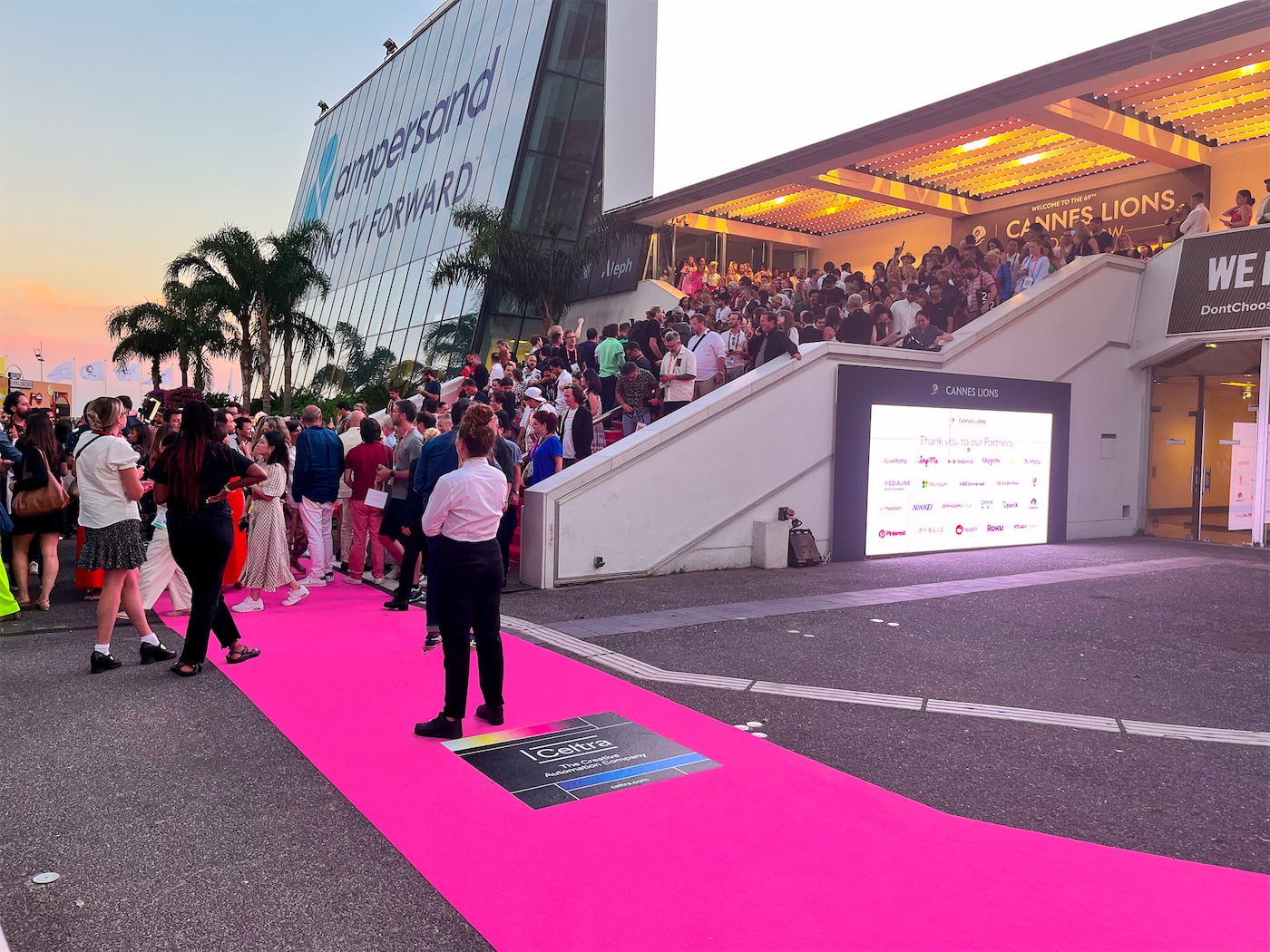
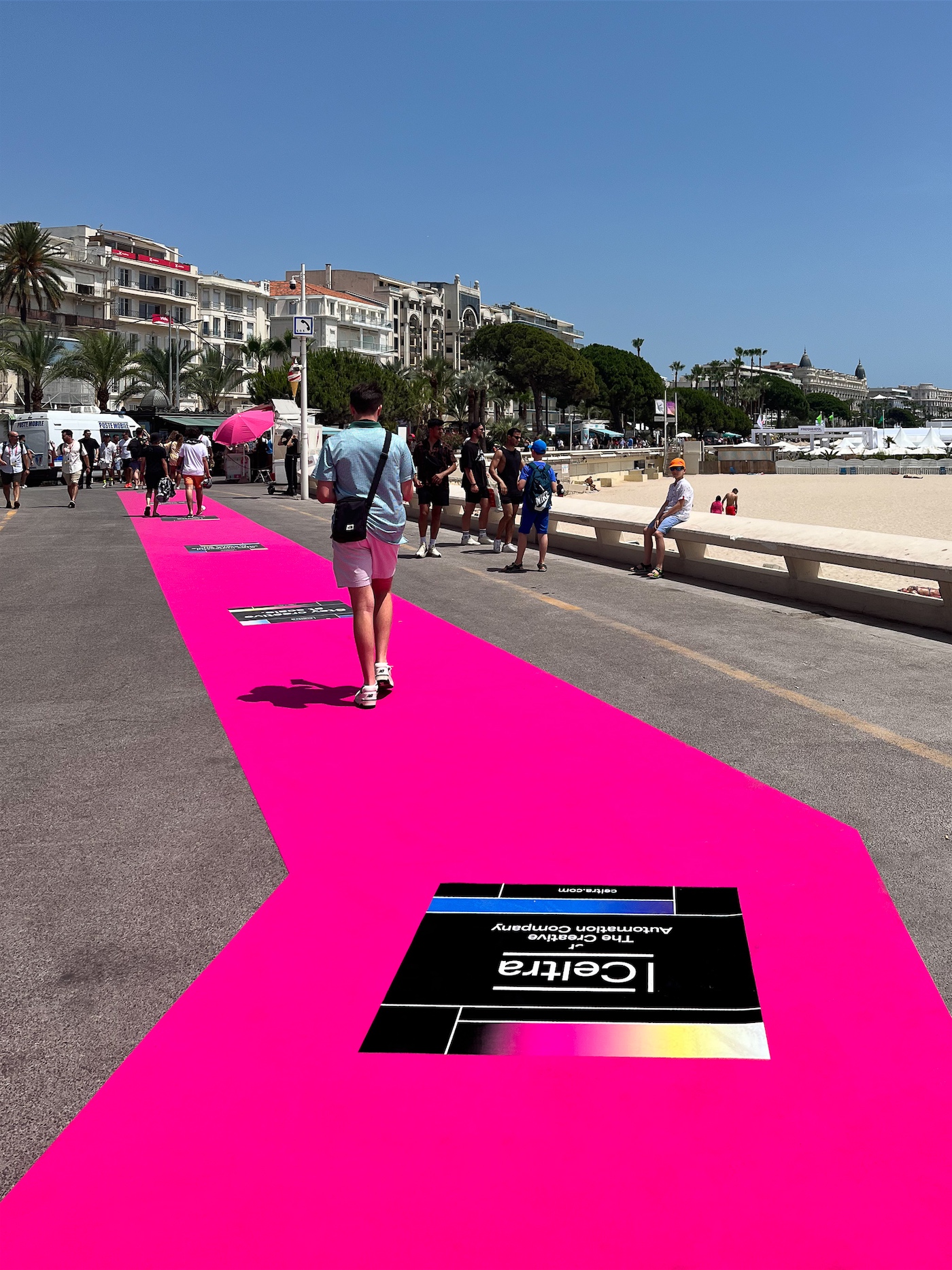
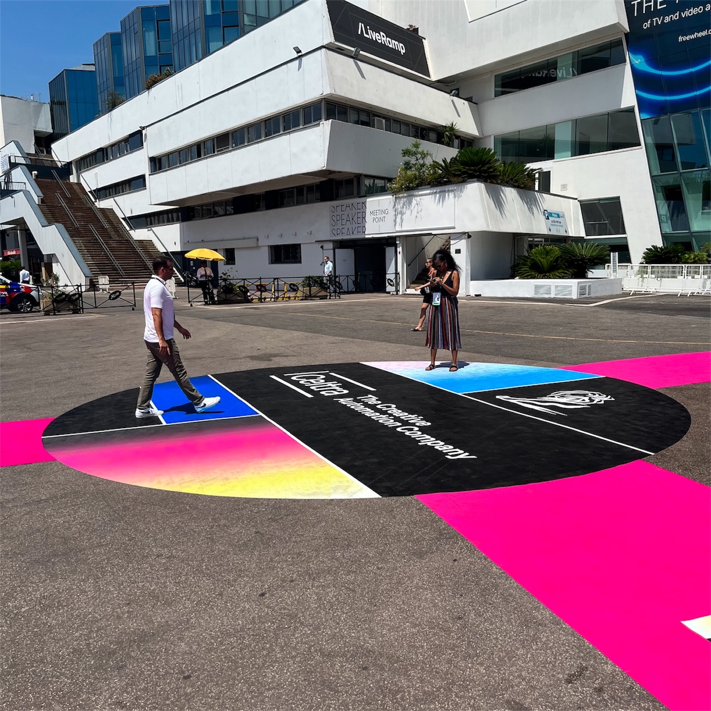
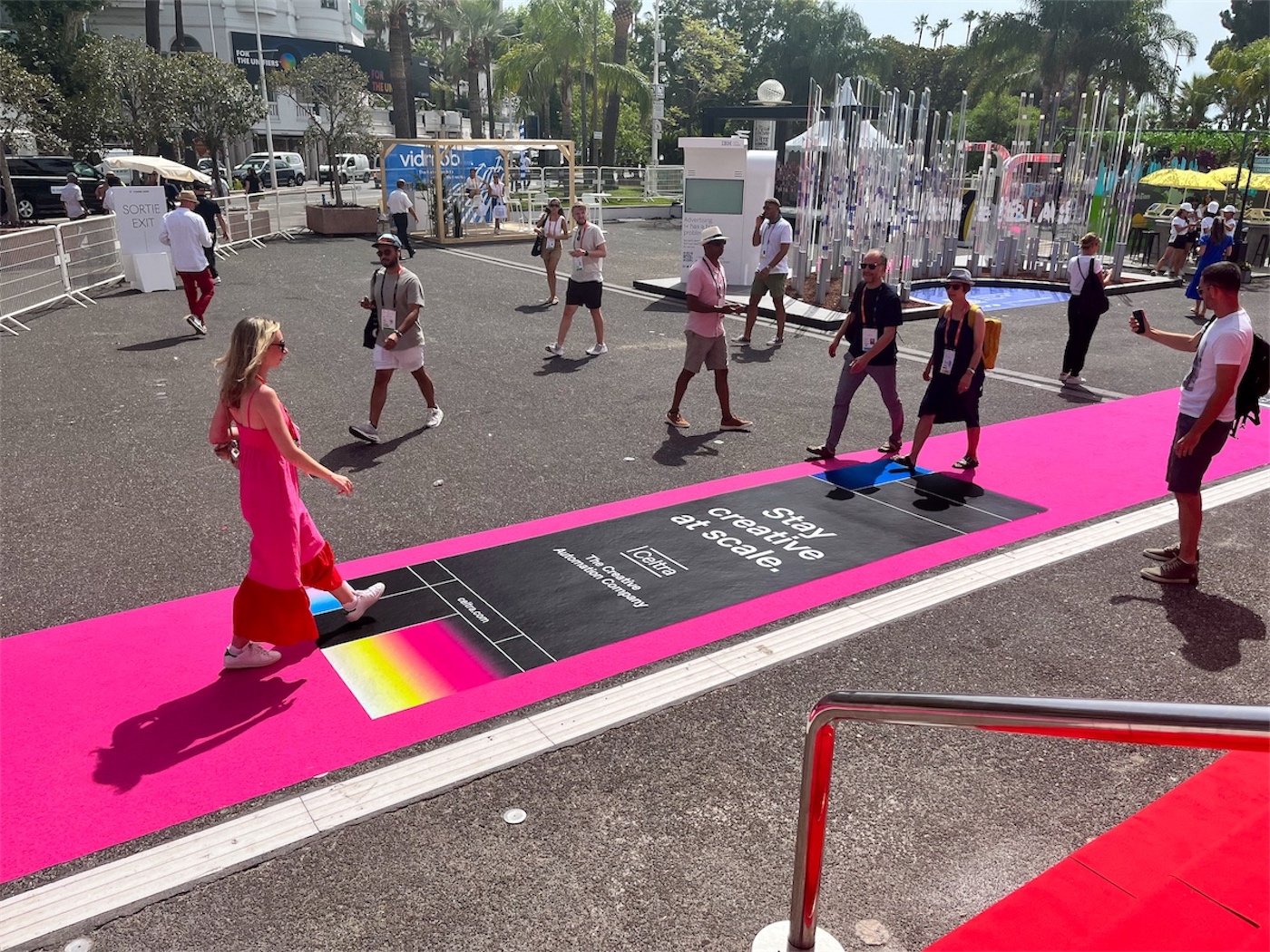
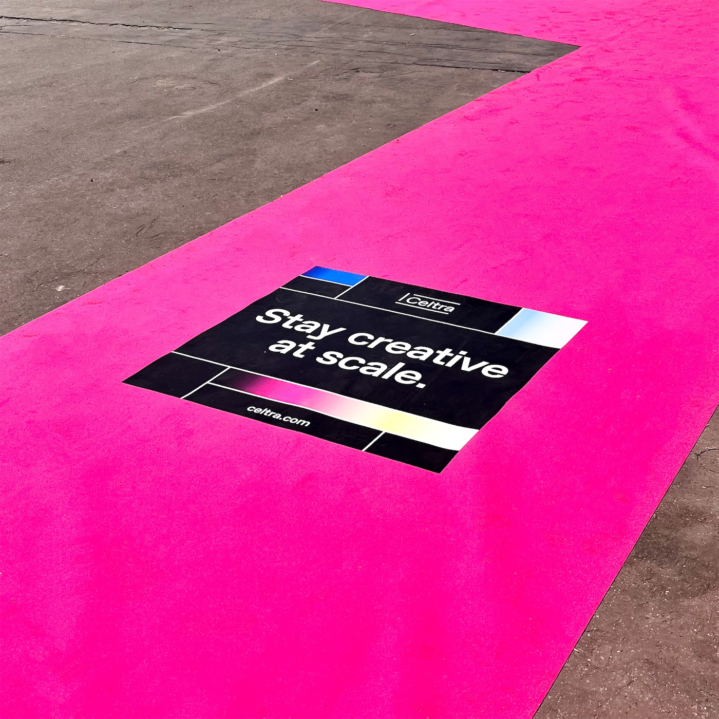
Celtra Cannes Lions Carpet Takeover
Role
Graphic Design, Art Direction, Production Design
Collaborators
Copywriter, Brand Director
Stakeholders
CEO, EVP Marketing, Cannes Lions Team
Project date
March - June 2022
The Ask
In early 2020, Celtra launched a huge rebrand and major new product offerings geared toward brands and agencies but was never able to do much in person marketing. For the past two years, the majority of marketing sponsorship opportunities were online only through online conferences and webinars. With the Cannes Lions marketing and creativity conference back in person in 2022, Celtra’s marketing team thought it would be the perfect place to have a big splashy in person presence again. Celtra had sponsored Cannes Lions in the past, but with the old branding, so we thought we could use this sponsorship to reintroduce ourselves.
There were a lot of sponsorship opportunities at Cannes, and marketing decided to do a red carpet takeover. My job was to work with Celtra’s marketing team to choose the color of the carpet and figure out what should go on 80+ unique ad placements on the carpet. As the only designer on the marketing team, I was responsible for everything from concepting to delivering the print files for production.
Concepting
The team held a few brainstorming sessions in FigJam where we referenced what Celtra had done for previous red carpet takeovers. I started sketching some early ideas of what we could do and what was possible, while documenting questions that we had for the Cannes team around requirements. For example, some placements had to have the festival’s branding and wayfinding information, so we had to do a lot of explorations to figure out ways for our branding to coexist.

Early design explorations using working messaging directions. We were working on copy and design simultaneously to figure out how much copy could comfortably fit.
Cannes Lions can be a bit of a sensory overload and our ads would be on the ground so we wanted to make sure that it would be legible while walking and that footprints wouldn’t leave too much of a mess. We decided to keep the design simple and use our dark color scheme.
Messaging Concept Directions
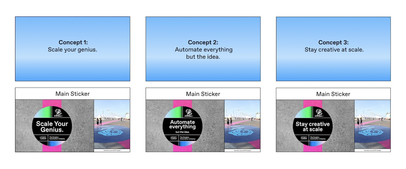
Once we locked down the general design direction, we put together a deck to pitch messaging options to company leadership. Since we weren’t able to go to the location to get a sense of the space, I created a series of mockups and reference photos to help people imagine what it could be like, plus references from previous years.
Production
Typically when working on out of home placements, I’ve found that it’s really important to print everything out, put it up on the wall, and collaborate in person. Since we’re an entirely remote team working across continents, we had to come up with a rigorous process that would allow us to easily stay organized and on the same page. With the festival’s guidance, copywriting made a spreadsheet covering size, location, cobranding, and what copy was needed for each placement. We were struggling to visualize how everything would come together, so I took a simple map given to us from the Cannes team and overlaid each of our 80+ placements on the map, plus labels for each one that allowed us to quickly cross-reference the spreadsheet.
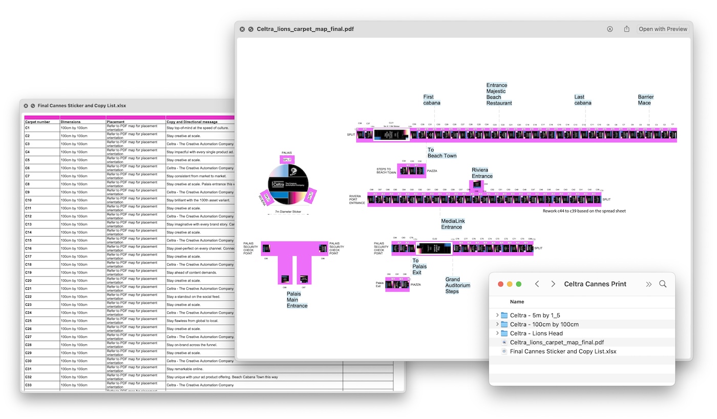
At multiple points throughout the process, our team got on Zoom and used the spreadsheet and the map to go through a robust proofing process to make sure we weren’t missing anything and that everything matched the requirements. At the end of these sessions, our team collected production and placement questions for Cannes and shared them back with their team for input.
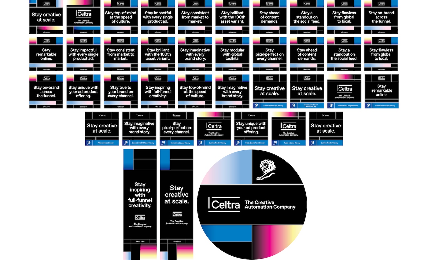
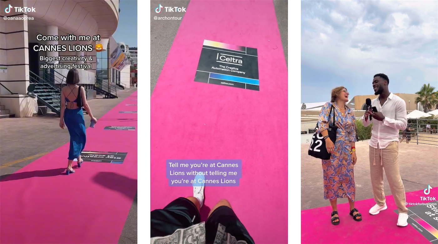
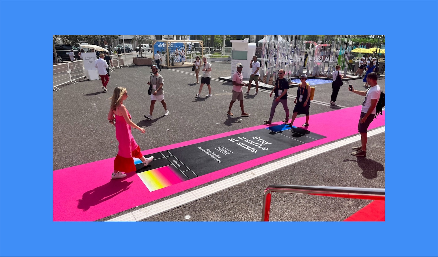
Cannes Lions 2022 “Red” Carpet
