Celtra About and Careers refresh

Role
Lead designer
Collaborators
Head of recruiting, copywriter, performance marketer, external freelance web developer
Stakeholders
CEO, CFO, Recruiting
Project date
August 2021
The Ask
Recruiting came to the marketing team asking us to refresh the company About page and develop new pages to support recruiting efforts. The company About page needed to be refreshed to reflect the fact that the company had moved to remote-first hiring. In addition, Recruiting knew that they needed to put more of an emphasis on telling the story of why people should work at Celtra. They also wanted us to tell more specifics about what it was like to work on the different teams at the company.
Before
The About page had out-of-date information, such as old office addresses. The executive team had grown, but the old design didn’t support adding more leadership roles.
Recruiting pages were hosted on an external platform’s website, Recruiterbox, and were missing key features, like the ability to search by role and location. The existing recruiting pages were also mostly unbranded because they were on an external platform. When sharing the links with applicants, the pages they were taken to weren’t very branded so it was hard for Celtra’s personality to stand out while doing outbound recruiting.

Process
We had a kickoff meeting where Recruiting shared their vision for having a unique page describing every department at the company. They also mentioned that they were open to feedback and suggestions from our team.
I researched examples of how other similar sized and larger companies were handling their About and Careers pages. I noticed a lot of the companies that had individualized department pages were much larger than us and in some cases had departments that were as big as our entire company. Meanwhile, we didn’t even have a Careers page, the About page took you straight to the Recruiterbox listings. It felt like we were missing some key information before having individualized department pages.
Then I met with our developer and the head of Recruiting to figure out how Recruiterbox worked and whether our plan offered API support in hopes that we could host the job listings on our website instead of on their platform. This way we could keep people on our website and have a more branded, personalized design. Our developer told us that it was possible to use the API and it was really easy to do.
I came back to Recruiting and the CFO with my findings and a proposal for how to simplify. We didn’t have the design, writing, or recruiting resources to maintain 12 different pages, so I proposed in addition to the refreshed About page that we introduce one centralized Careers page. I also proposed that we bring the job listings onto our website. Marketing was excited by the plan and appreciated that we found a way to build something that we can get out quickly and then grow with as the company grows.
I then worked with copywriting and recruiting to get a sense of what kind of information we should display on each page. I helped them figure out how to translate what they wanted to say to a web format, including things like giving them a word count.
I also worked with our in-house icon designer to commission a new set of city icons for each of our company locations to better highlight our offices. I reached out to people in the non-US locations, like Singapore and Slovenia, to make sure the icons we commissioned felt representative of their locations.
![]()
While working on this project it became clear to us that our site’s navigation was too limited. We needed to introduce these new pages into the navigation, but the existing navigation didn’t have any room for even one more item. I designed a simple dropdown menu system that could help our navigation grow and worked with the product team and other designers across the company who had built the original navigation.

I worked alongside the developer to make sure the design would work well within our Wordpress-based website and would allow for future customization. I provided feedback and made some adjustments to the design based on some technical limitations. For example, the Recruiterbox API had some limitations, so once the developer researched more deeply into what was possible, we made some small layout and hierarchy changes. I also provided feedback on custom animations and hover states that we were introducing.
Results
Recruiting was pleased with the new pages and was grateful that we created a more robust presence without introducing new platforms or processes to them.
About Celtra
Changes made to support a full photo and copy refresh, updates to leadership section allowing for current and future company growth, and changes to structure and copy were made to reflect the companies recent change to remote-first hiring.

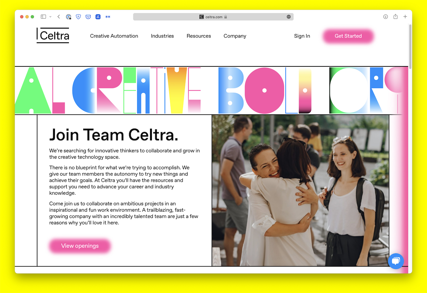
Join Celtra
Brand new page designed to provide a high level overview of the culture and values of Celtra.

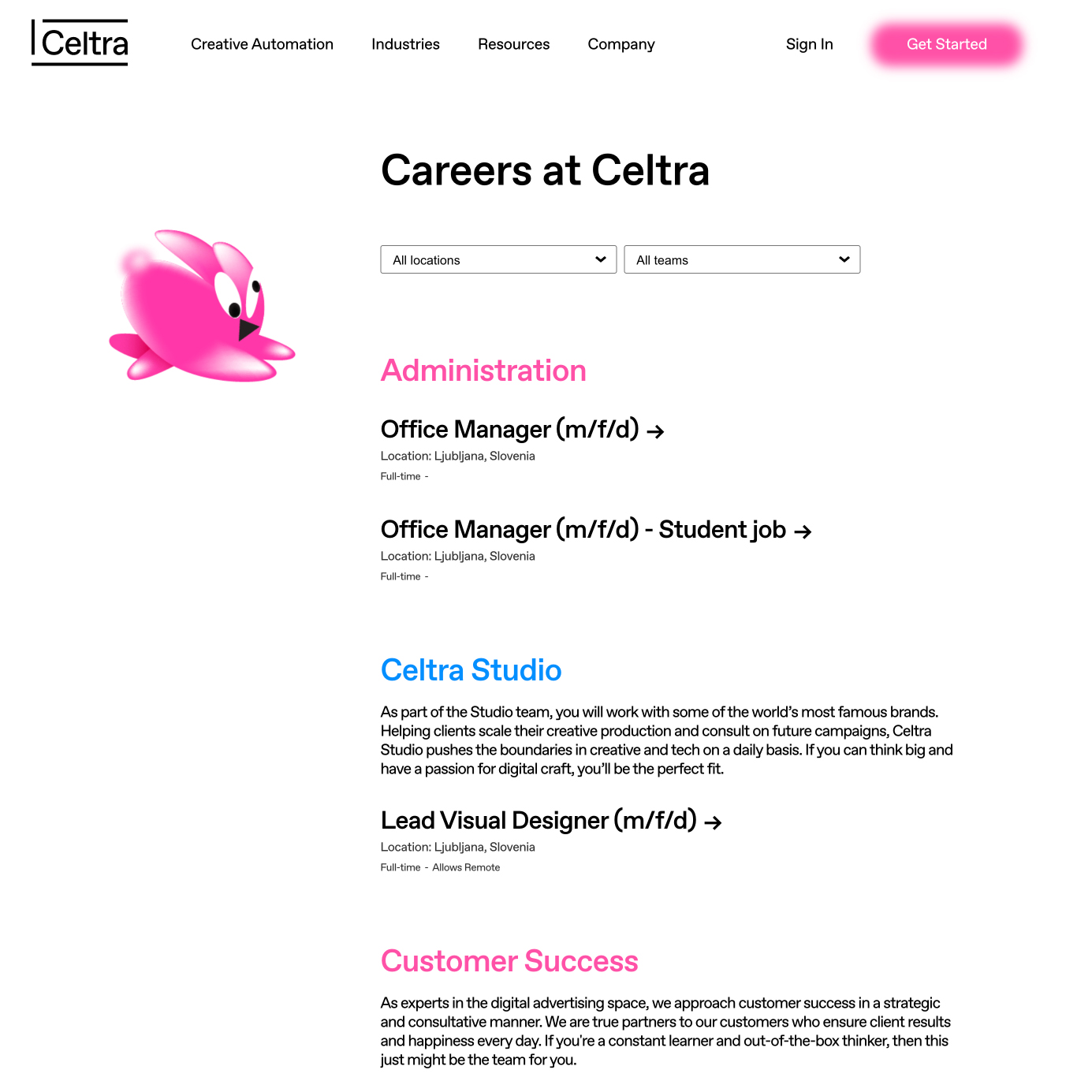
Job Listings
Brand new page built to bring our job listings to our website and support the ability to sort via department and location.

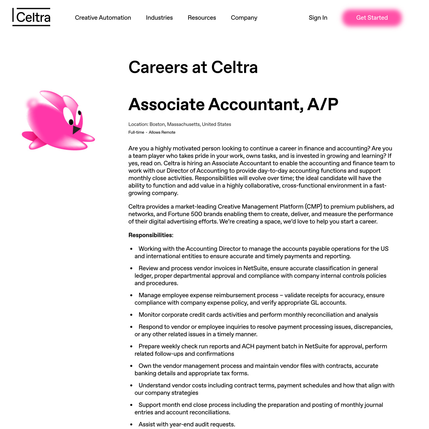
Individual listing
