Starry - Customer Signup Email Series
Role
Lead designer
Collaborators
Senior Copywriter, Head of Email Marketing
Stakeholders
Director of Growth Marketing, Creative Director
Project date
January 2020
The Ask
Growth Marketing and Email Marketing reached out to the Creative team asking for a design refresh of the email flow that prospective customers get when they schedule an internet installation with Starry. Their initial ask was for a fresh coat of paint that made the emails exciting and made people look forward to becoming a Starry customer.
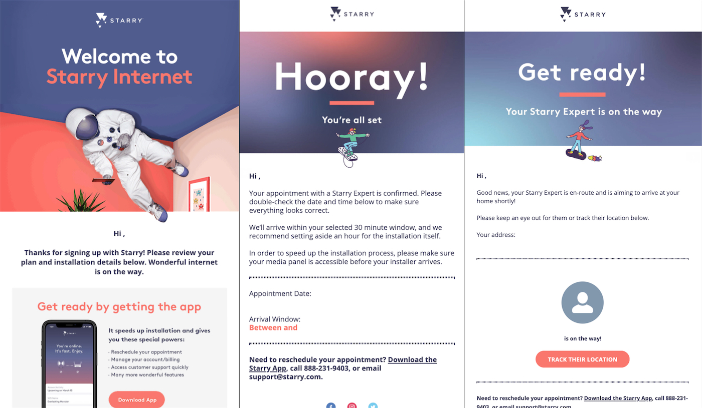
Before
Process
In the initial kickoff meeting, the copywriter and I asked for more specifics on what was and wasn’t working about the emails and for the historical context of how the emails came to be. The limbo between when a customer signs up for Starry and when we come to install is the most important part of the customer acquisition flow since there’s a high probability of people cancelling their appointments. Keeping people informed and excited was one of the most effective ways to keep people excited to be a customer, which was why Growth Marketing and Email Marketing thought that a fresh coat of paint would be the right solution.
In our conversation it became clear that the overall flow and content of the emails wasn’t working and was causing confusion. It wasn’t always clear when the install would take place and people often forgot the terms of what they had signed up for, to the point that people were dropping off and cancelling their appointments. People also didn’t know that they could reschedule or call in to get an earlier appointment.
The Marketing team scoped the project out to be a one week project where we’d be refreshing the email series. The copywriter and I came back and asked if it’d be possible to slow down the process and add a series of check-ins. Based on the problems they were telling us about, it seemed like doing some explorations on content was essential.
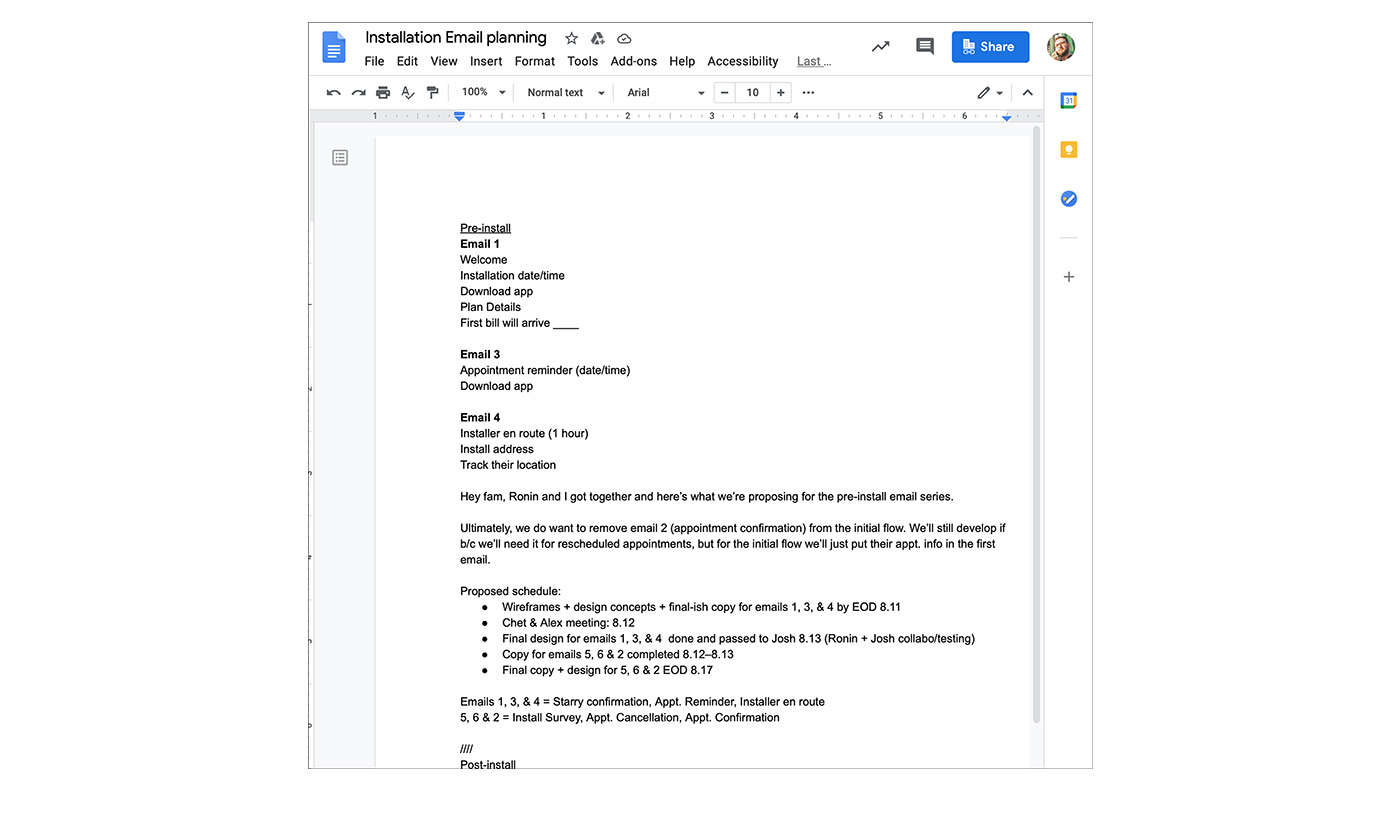
The copywriter and I started a process where we circulated a Google Doc among the stakeholders where we collected all of the things the emails need to do and asked people to try and reimagine the emails just in bullet points to help us try and focus the emails and see what information was truly necessary. Once we had that doc, we made a text outline of each email to help people see what information would be in the emails at a high level without being fixated on design or imagery.
Previously, all of our emails were designed in Photoshop and weren’t optimized for mobile. In my time there, we didn’t do wireframes and tended to create 3 fully-fleshed out design directions and then decide where to go. While this process created pretty emails, it gave little opportunity for stakeholders and copywriters to evaluate an email’s messaging and content and it was easy to get stuck in the weeds of the aesthetics. This process might work for a routine marketing email, but this project felt big enough to warrant pushing back and proposing a slower process that allowed us to really evaluate the emails without aesthetic getting in the way.
Using the email outline that the copywriter and I helped the stakeholders write out, we felt it was really important to wireframe out these emails. While we had complete brand assets for the majority of the emails, we felt it was important to include sketches and grey boxes to force everyone to focus on the information architecture.
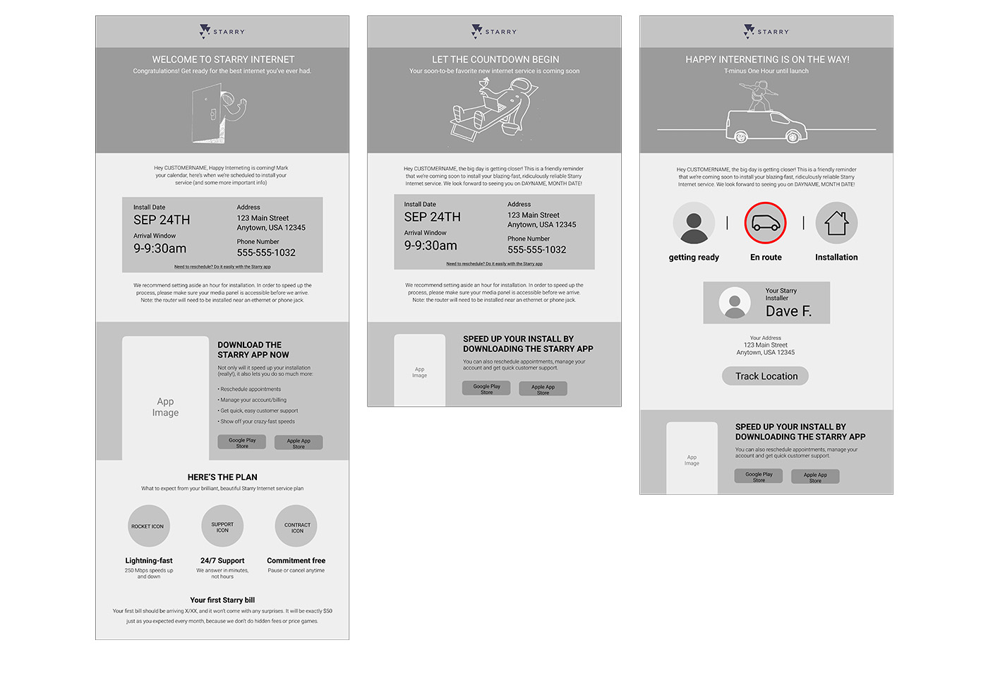
The copywriter and I were worried that the emails had too much information and that we would need to push back on the amount of content. The stakeholders, upon seeing the wireframes, came to the same conclusion. The wireframes helped them imagine the user flow and realize that these emails needed to be really concise. Otherwise, we’d say so much that people would miss the essential information.
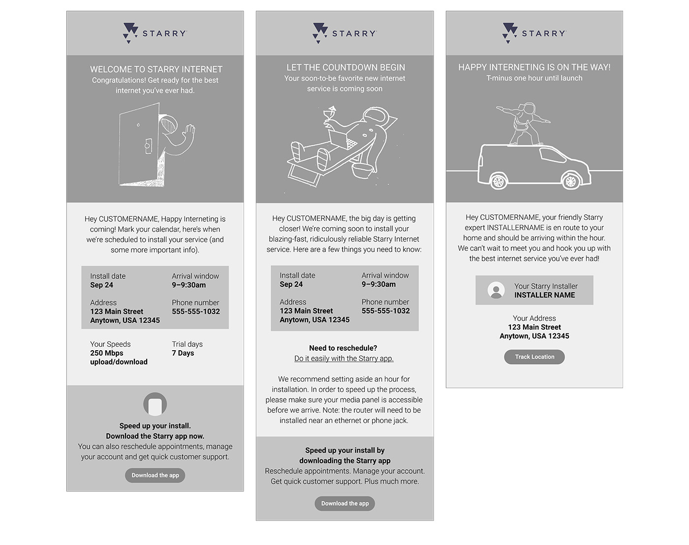
After getting feedback on what information we could cut, we were able to land on a much more concise set of emails. We did another set of wireframes and they were quickly approved, allowing us to move into final design and final copy without much need for more revisions.
The Creative team was primarily people with print and branding experience, so the majority of our emails were designed in Photoshop. In addition to introducing wireframes and a slower process, I also used this as an opportunity to pilot using Figma. This allowed me and the copywriter and the email developer to collaborate more easily.
Previously, all of our emails were optimized for desktop despite the fact that the majority of people were viewing the email on mobile and mobile only. I also designed a mobile-first layout.
Results
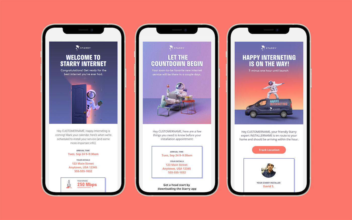
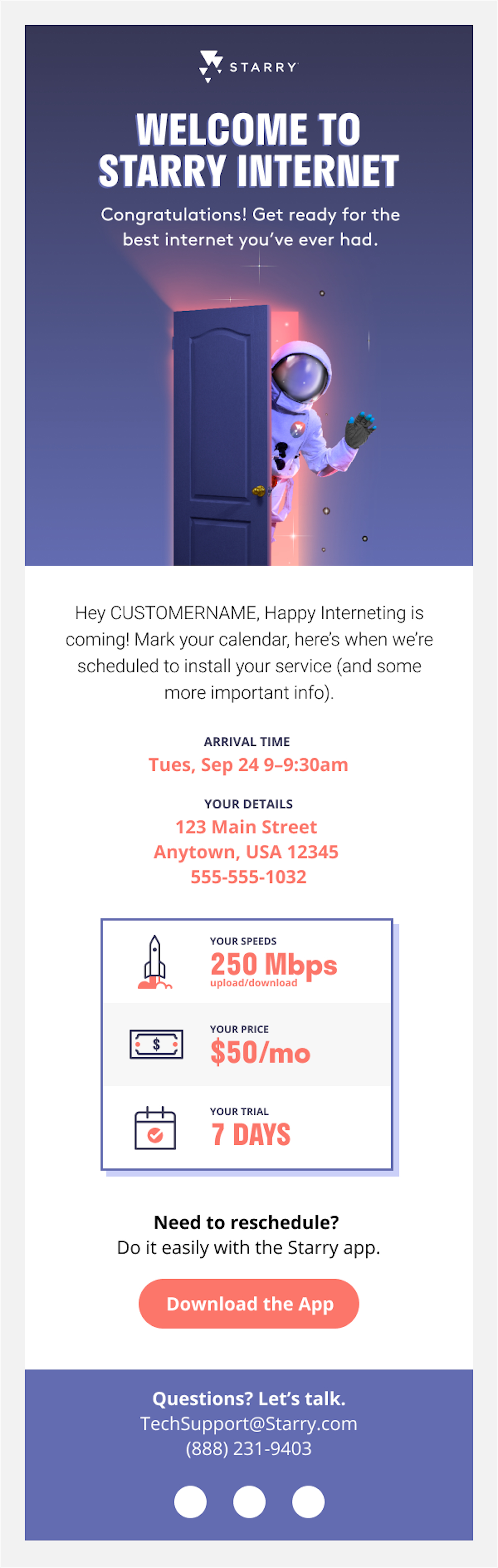
Sign up confirmation and welcome
The intial email a customer gets after scheduling an installlation. Designed to confirm and plainly state the plan they signed up for and remind them of the great deal Starry services is providing.
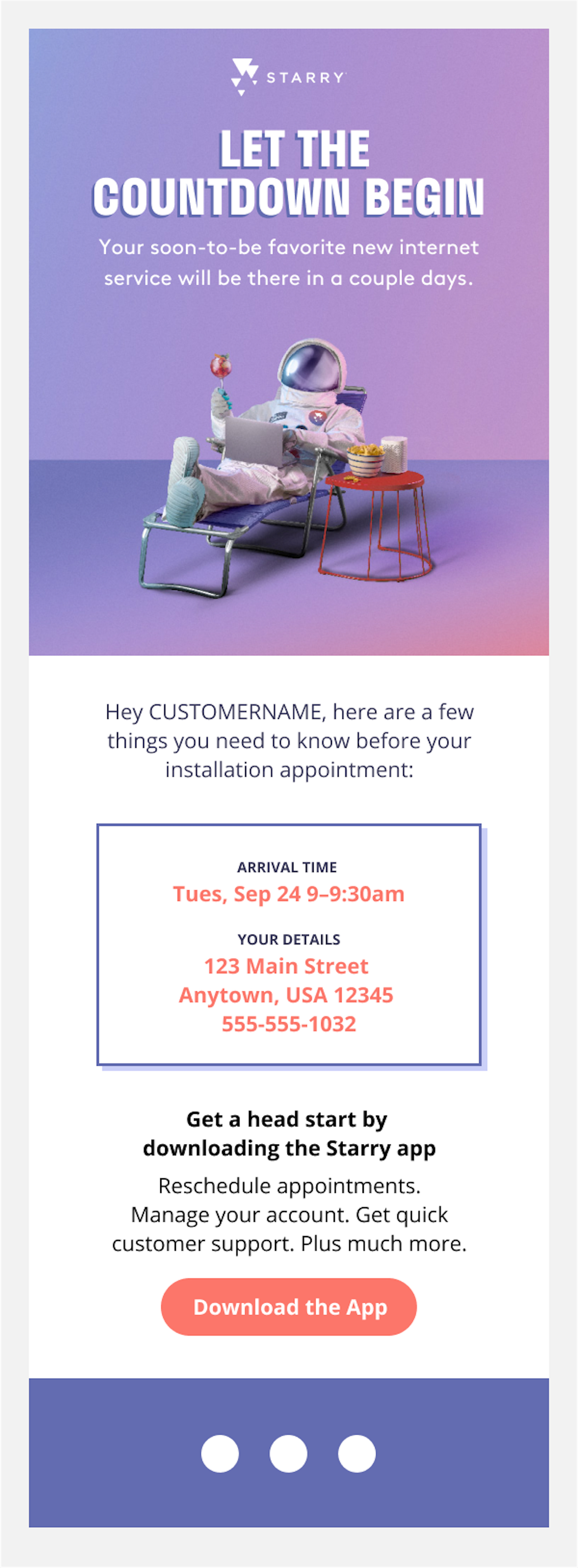
Reminder email
Since an install might not be the same day that you sign up, it’s important that Starry sends out an email reminding people of when their install is and also offering them a chance to reschedule. Previously, people would sometimes cancel their install around this point because they were no longer available that day. With the update to this email we were able to let people know that if they can no longer do that time, they’re welcome to give us a call and we would accommodate them.
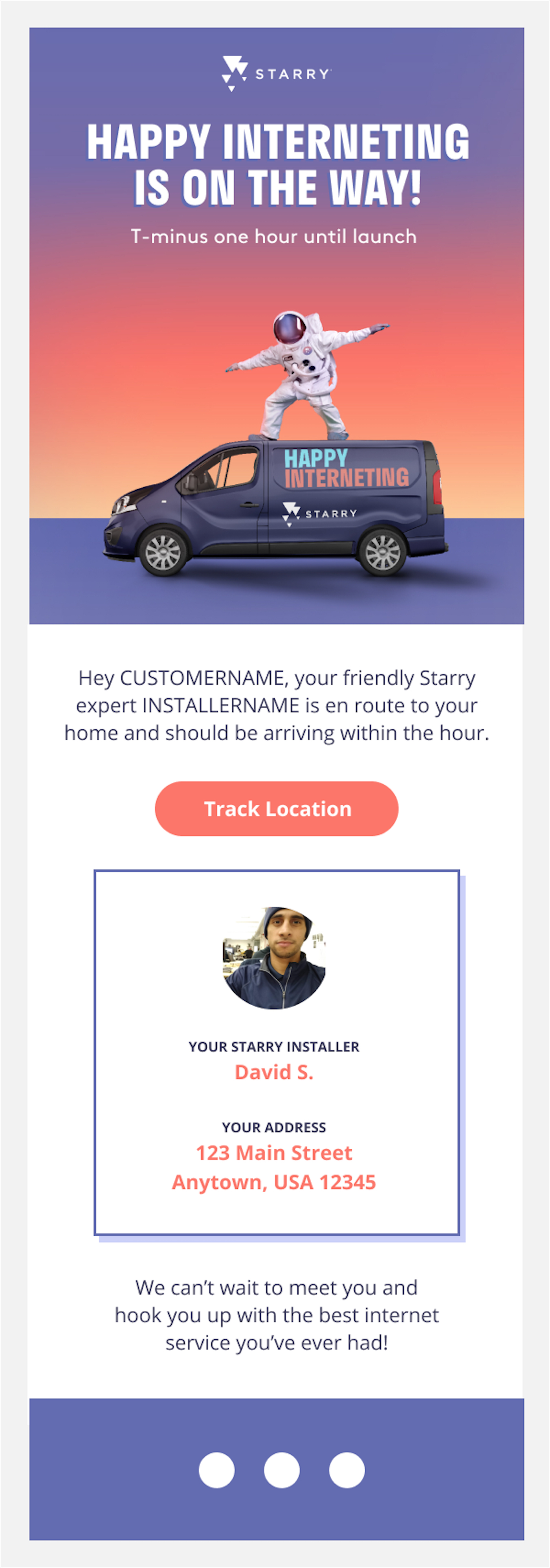
Install Day email
Other internet services let you select what day the installer will show up, but you have no transparency into what time they’ll show up and you can often find yourself waiting around all day. A differentiating factor of Starry is that customers can sign up for for 30 minute install windows. On install day, Starry sends an email letting the customer know that the installer is on their way with a link that allows them to even track and see how far away the actual installer is.